The site supports light and dark modes
The hero animation highlights all of Stedi's products, as the EDI file evolves across various file formats
The diagram is an extension of the hero animation for easier comprehension
Site navigation dropdown
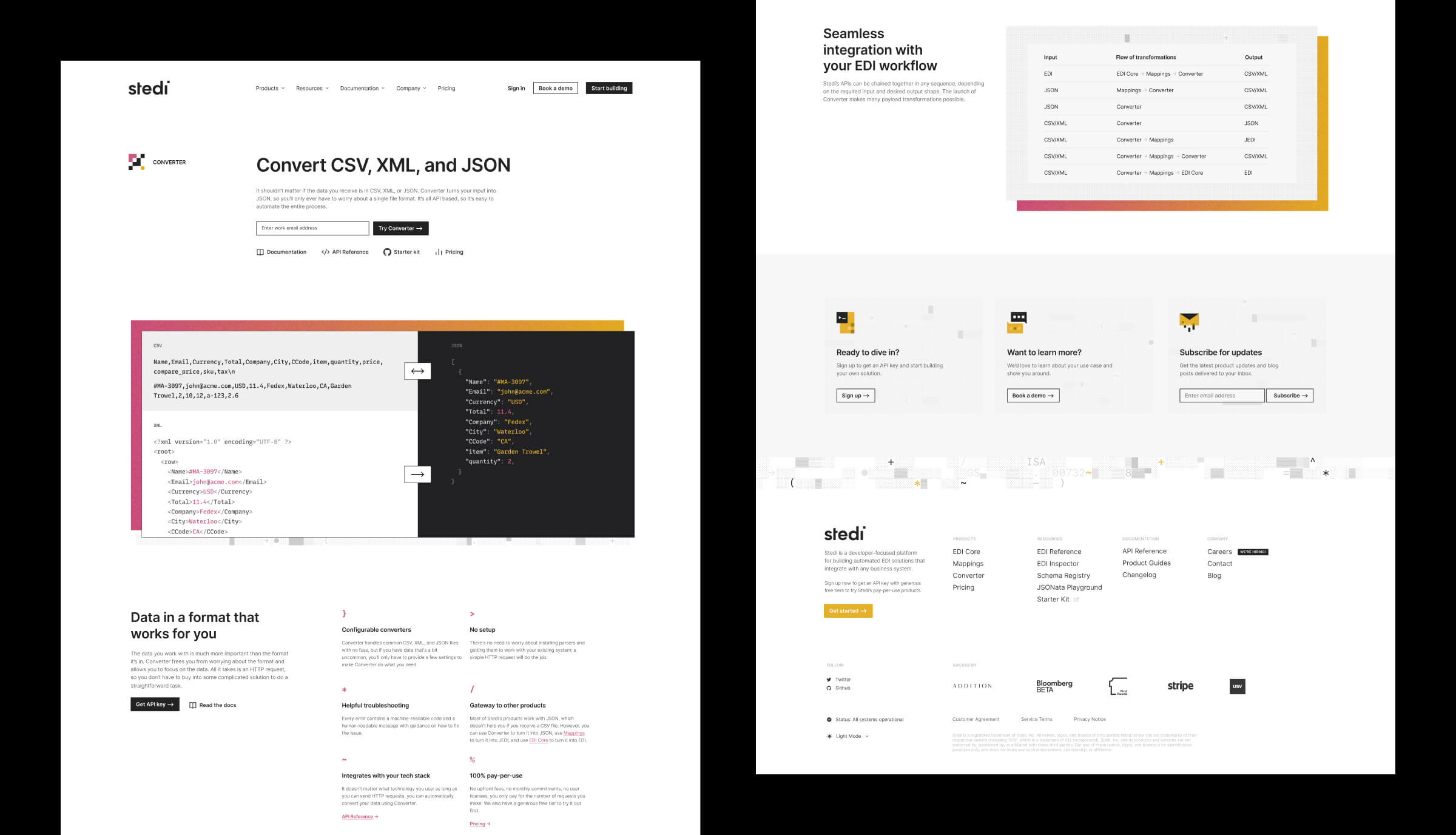
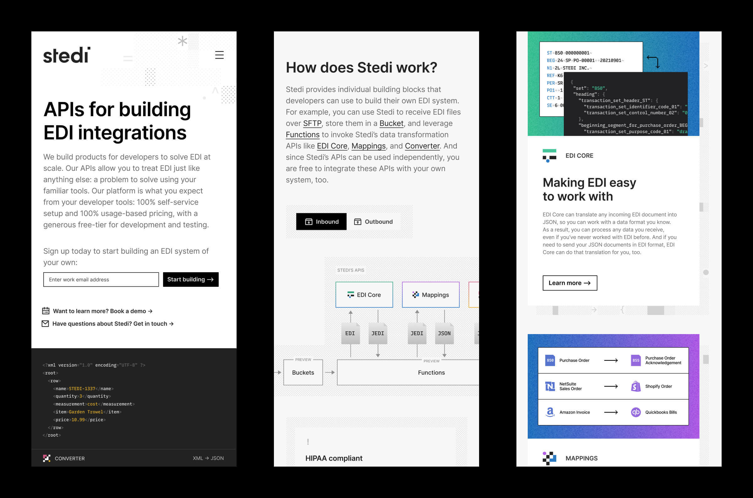
Product page, light mode
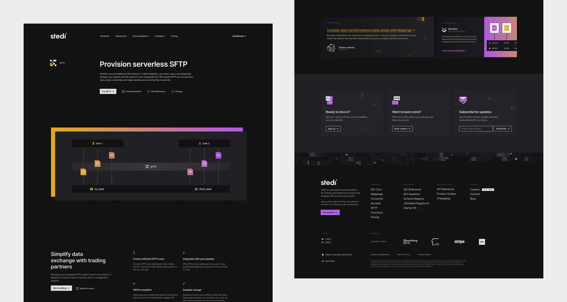
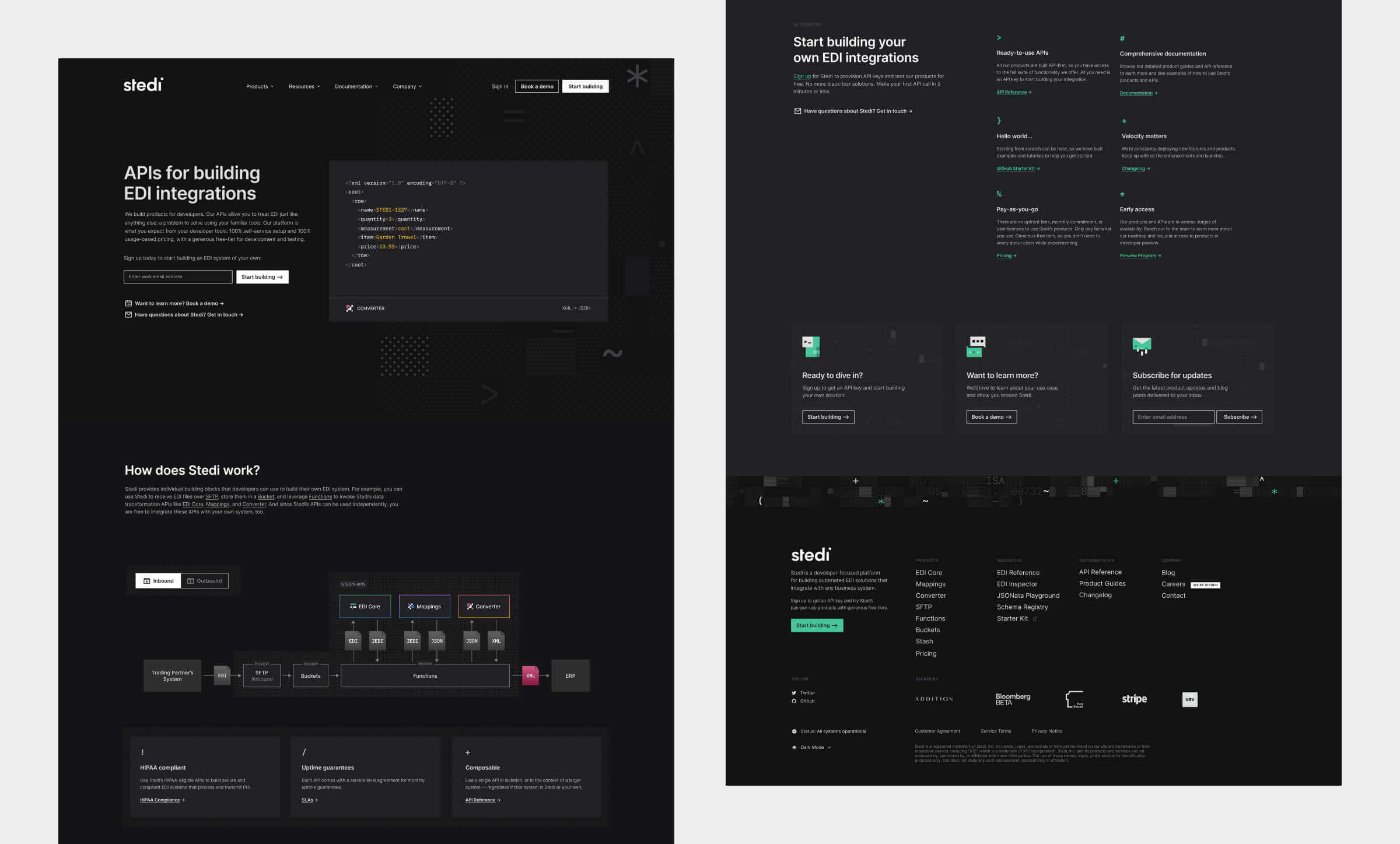
Product page, dark mode
Open Graph images for the product pages
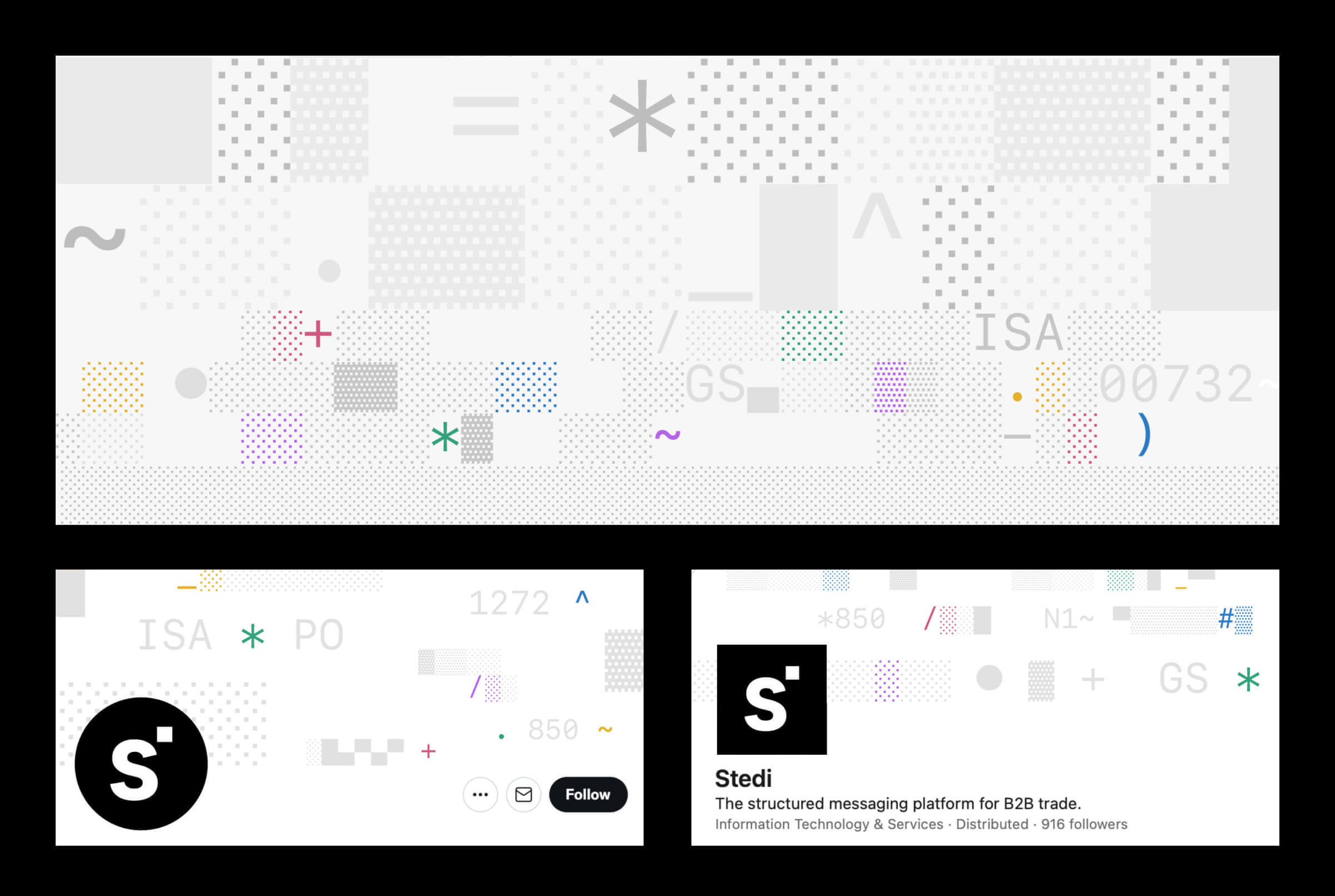
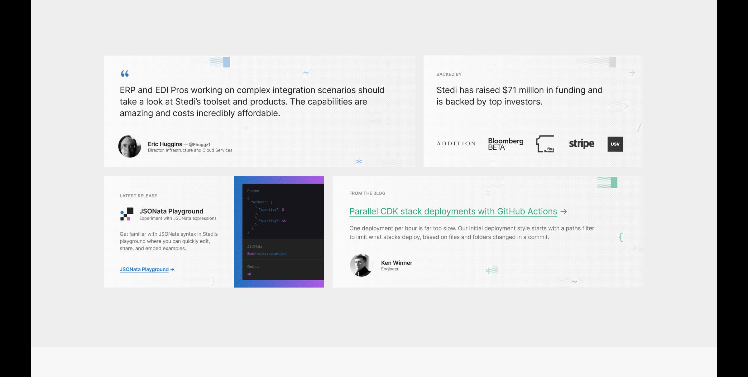
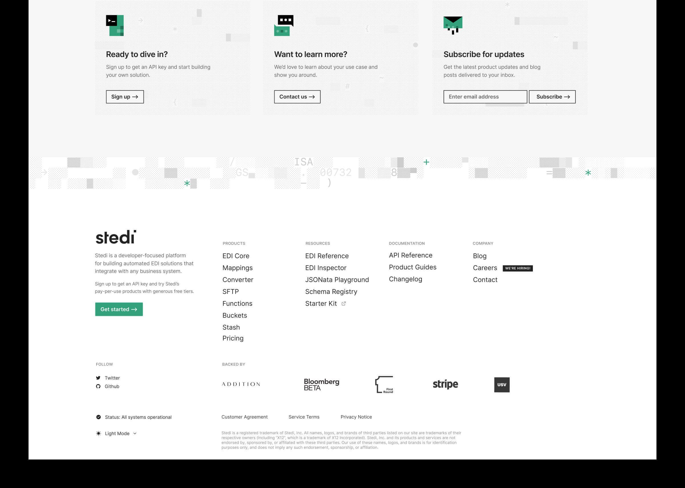
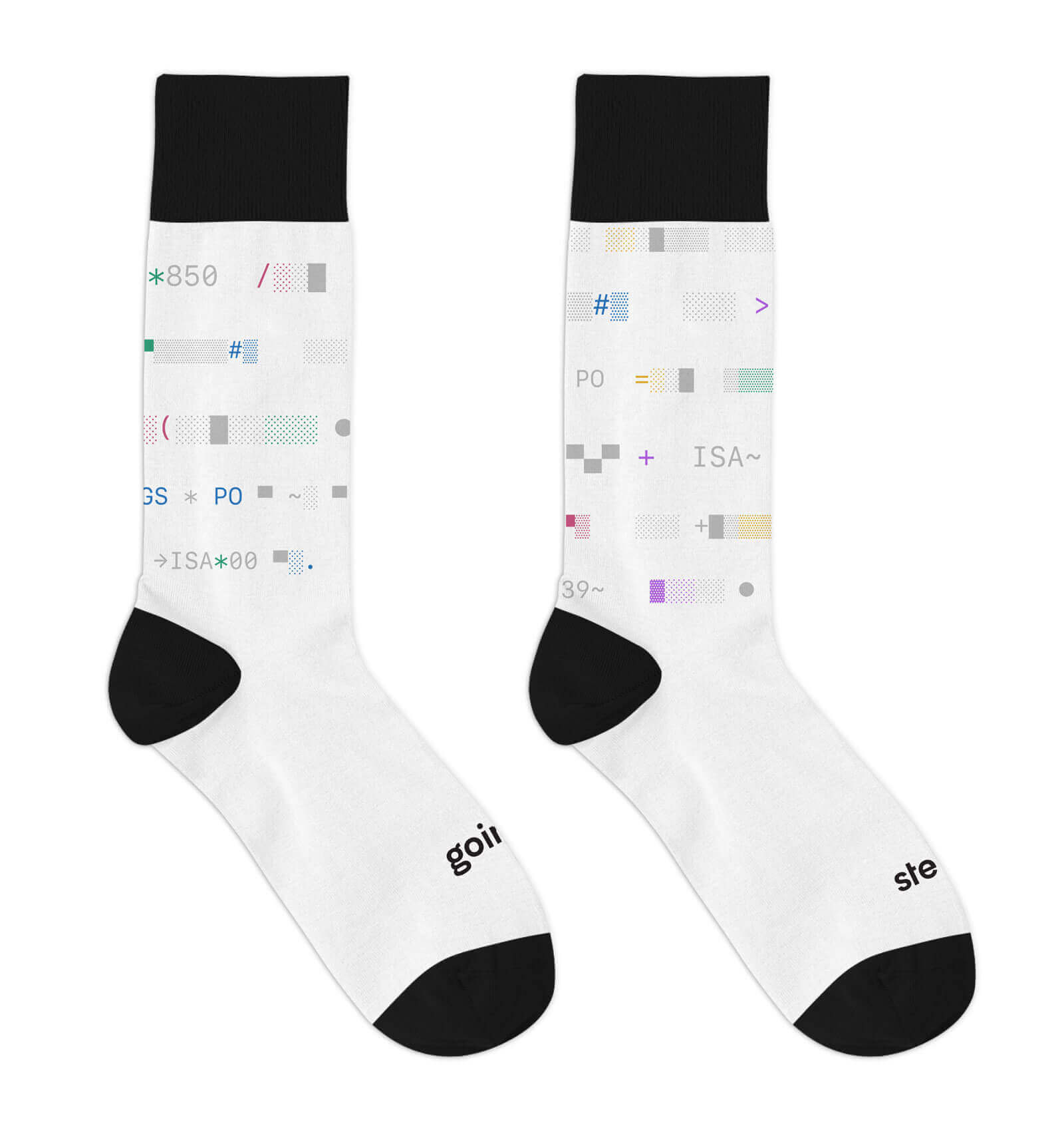
The pattern, affectionately named "EDI-fetti," is a clever composition of Unicode block elements and typographic glyphs
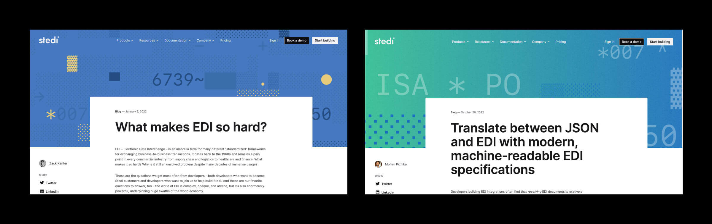
Blog
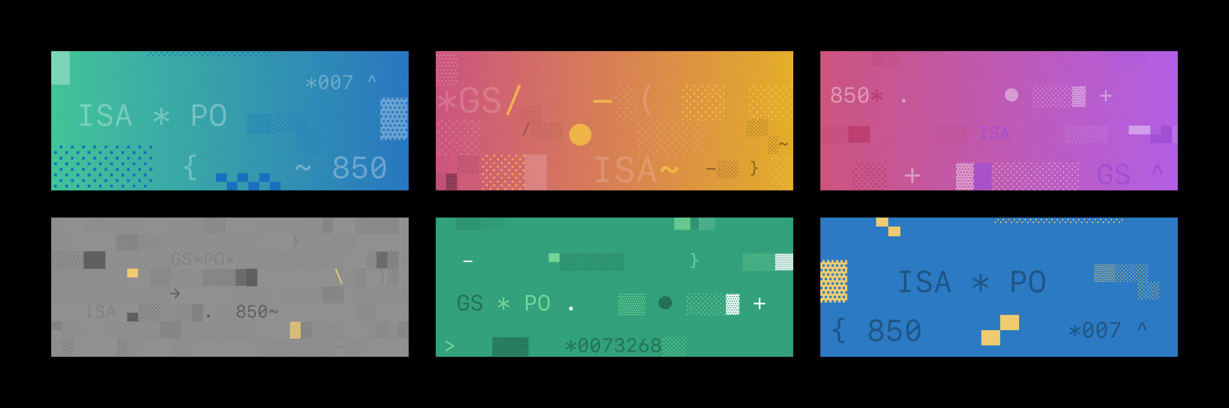
Blog headers
Spot icons for the careers page and footer
Product icons
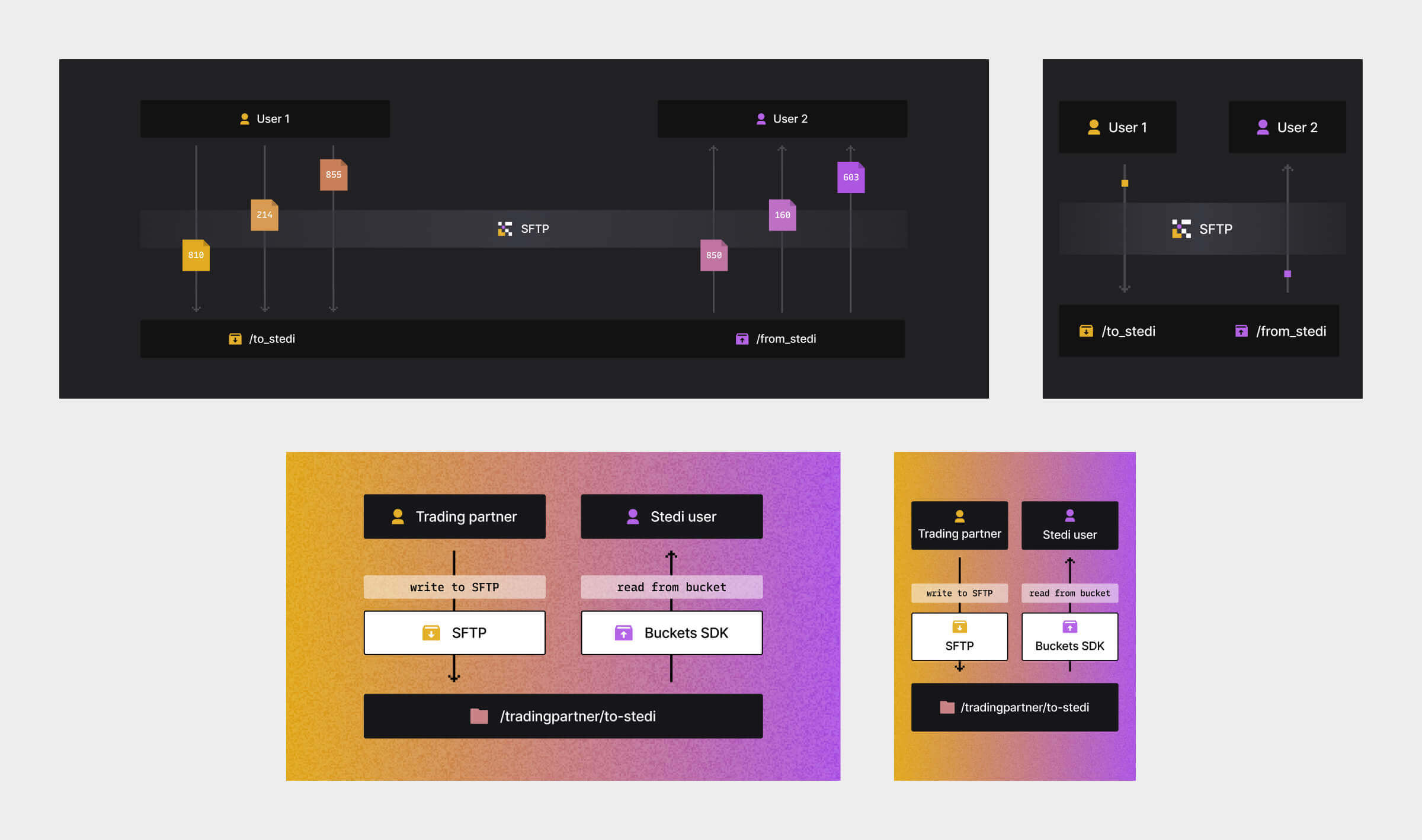
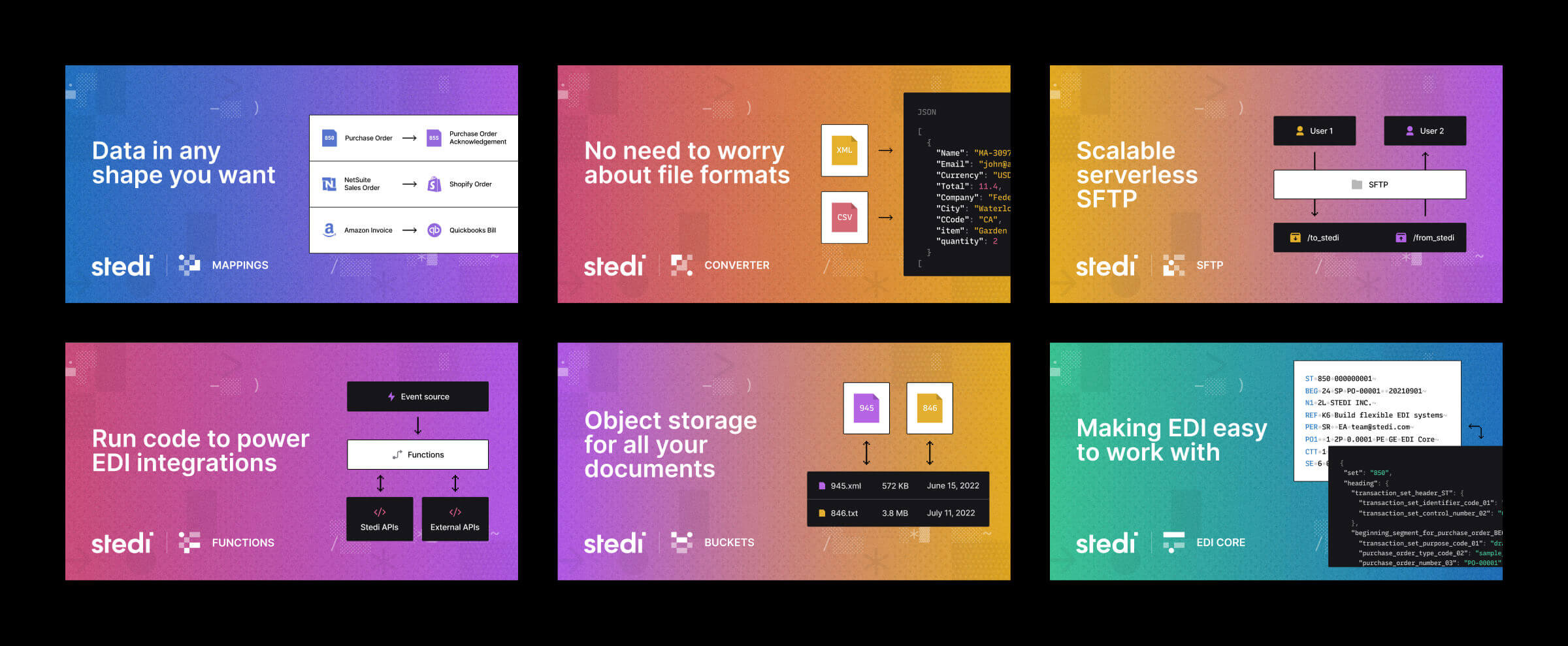
Product illustrations
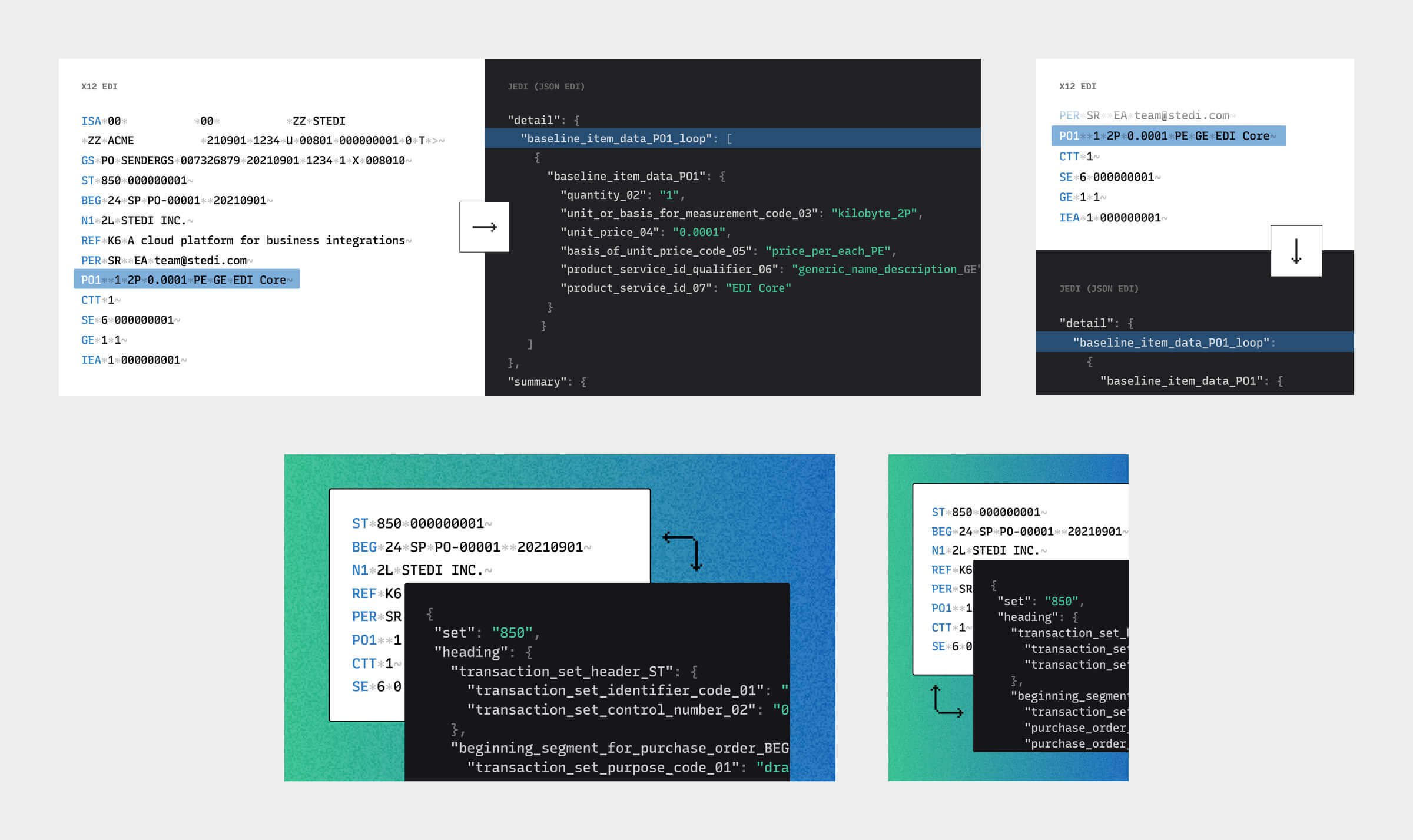
Product illustrations
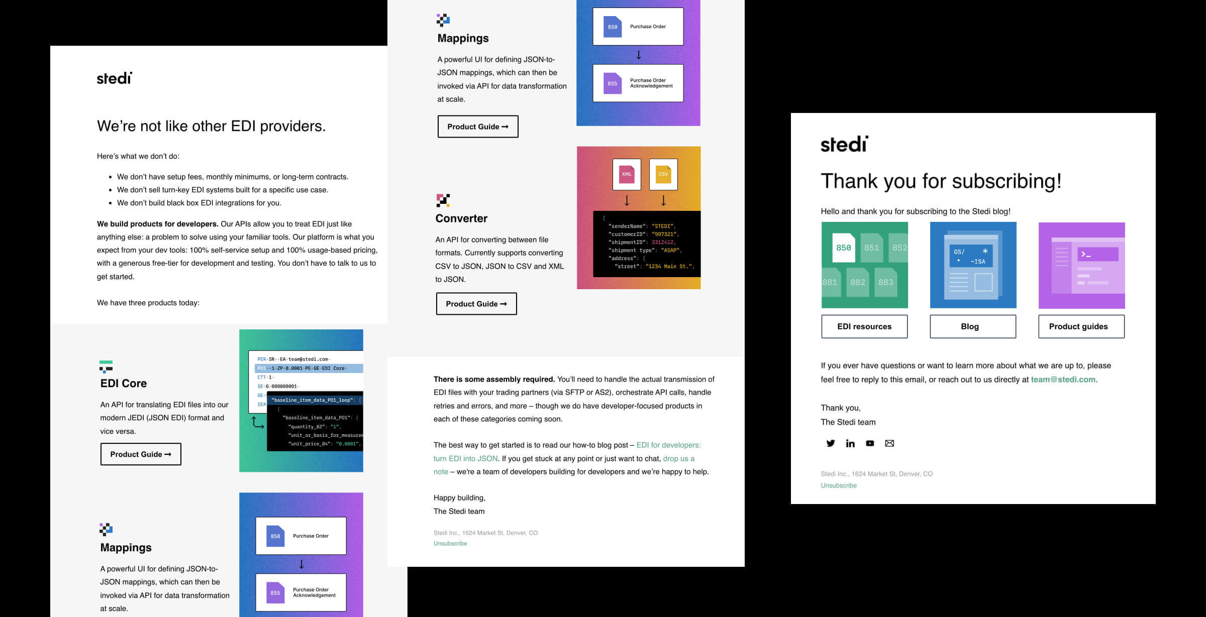
Email designs
 Next up, Mapbox Homepage ➯